Tuesday, 28 November 2017

Analysis of Print and Moving Image Adverts

Analysis of Print and Moving Image Adverts - Rhys Wallett


In this ad from "Salvations Army", we can decode how they have used certain media techniques to promote this charity which care for the poor. For starters, we can analyse how they have deeded to use the colour rule of three with black, red and white which have pragmatics of nuance, simplicity and tradition. Therefore, this allows a juxtaposition from tradition and abstractness to be shown in the advert as the abstract can be argued by how Salvation Army have gone for the unusual decision to make the CVI a small collection kettle which is insignificant enough to allow lots of white space to be shown in the ad, connoting class.

Class can also be shown with the decision to make the main headline which says "When you put money in our kettle, expect change." be written in serif font, which has connotations of class and sophistication. Yet this decision to make the advert sophisticated is interesting as a typical charity do not care about formality or manner, especially Salvation Army who care for the poor and homeless, thus the class act is intentional to tell their target audience charity is not the grunge, displeasing stereotype we commonly associate with it, and how charity deserves to be respected and listened to.

Furthermore, the choice to use a quirky yet powerful pun in the heading (with the pun 'change' being a link to change in the world and change from your pocket) is effective as it allows a 'riddle' of sorts to be embedded in the title, giving them the audience pleasure we receive when we decode a hidden message in an advert, which will then lead them to consider the seriousness of the situation and therefore they have used the puzzle of the pun to grab an audience's attention to donate towards their charity. 

Simplicity is a huge part to this advert and its effectiveness. There appears to be no demonstrative action, nor intertextuality, or even applying to fear or desire many advertisers do. Just a red kettle with a powerful heading and some disclaimers at the bottom. The simplicity is effective as it ensures that an audience does not tire of, or get confused by an advert that would be more complex, and is able to use the white space to grab an audience's attention as it is an easy peruse, yet still allowing iconic representation of the charity to be effectively portrayed with their USP being a red kettle as the CVI.

Plus, they have also broken the rules of the 'soft sell/hard sell' paradigm in this advert as stereotypically, charity adverts use hard sells and leech of the audience's feelings of melancholy, empathy and woe to push them to donate towards their cause, however in this advert, hard sell does not prove to be used as there is nothing an audience would feel especially glum about, nor it is a soft sell as it also prevents feelings of pride and self confidence to be inherited for the audience, it fits into neither category. I feel this is effective as it allows cold facts to be the focus and dismisses the emotional response they egg from the audience, allowing a straight up and therefore effective advert to be produced and distributed.


In this Boohoo TV advert however, from their advertising campaign "WeAreUs", we can infer different advertising techniques used to effectively sell their product and see how it primarily differs from the advertising techniques used in the Salvation Army's print ad.

Firstly, demonstrative action is shown in this advert in the close up tracking shot of the women walking in her wedges from Boohoo. This is effective as it allows there products to be shown in use, thus highlighting what you would look like in them, which would give an audience the knowledge and security that there products are usable and pretty when worn, and therefore will provide a target audience with insurance when purchasing their products.

Plus, we can also use visual codes such as the background in the advert to infer effective sales techniques, especially in the first half of the advert which the background proves to be the ideally blue, sunny and cloudless weather, which is considered the most desirable weather by the majority of the audience which creates a subtle hyperbole which states that if you wear Boohoo, you will be surrounded by sun and joy and be as happy as the model's in the advert. Plus, it also taps into the 'fear and desire' rule used commonly in advertising as it uses the 'desire' straight men and homosexual women will feel when seeing these models, especially the mid shot of the brunette model which the mise en scene shows her exiting a swimming pool in a bikini and smiling broadly. This sexual desire allows Laura Mulvey's male gaze theory to be shown in the advertisement and will attract male customers for Boohoo Men and the target audience of females as they 'desire' to be like these happy, beautiful models.

Plus, they also prove to use the 'soft sell' technique so commonly found in fashion ads as the decision to make all the models happy, wealthy and successful tells us they aim to make the audience feel somewhat bad about themselves as they are not these icons to aspire to, therefore if you purchase Boohoo's products, you will magically be as successful as these women and have their lifestyle, as they are also advertising the 'glamour' lifestyle in the advert. Yet on another note, their decision for iconic representation is rather interesting as while their particular products are shown constantly throughout the advert, their branding is not visible till the very end which allows a target audience to get excited about the products shown and finally given the brand from which they can purchase these products, creating a pique level of intrigue before flashing the brand image. 


Monday, 27 November 2017

Write up of our 'Star Vehicle' Media Project

Write up of our 'Star Vehicle' Media Project - Rhys Wallett


https://doc-14-58-docs.googleusercontent.com/docs/securesc/km2tgmndftsaj5j1ikovgtjhl6j3r4jv/h2u1728671lidp088526ls9emnbqu7vc/1511805600000/02371770692509184141/02872537224512968273/1t5cThbO1Zrc6R70m8_J6hfTOrX8cxD45?e=download&nonce=5dgei1kvqmvb0&user=02872537224512968273&hash=otrqejp9e30iqspav0jb1gf7qvhioqtv


For our media project, we had to choose a music author and see how their music videos contributed to their brand image, the reason for certain inclusions and their effectiveness and how an audience will infer from these music videos and what opinions they will form. Our group decided to go with the pop/indie phenomenon Imagine Dragons as we felt that all their music videos were so abstract and different from each other respectively, there would be an abundance to say about each specifically. While we did produce a video explaining vaguely what occurs in their 3 music videos "On Top of The World", "It's Time" and "Thunder" and how this links to their brand image, this write-up allows a more critical look at these music videos to form a further advanced interpretation of these music videos.

If we start with the music video for their hit song "On Top of The World", which was released in their 2012 album Night Visions, in our video production we argued the following bullet points about the music video:

  • Both narrative and thematic
  • Satirical by exploiting American conspiracy
  • Quirky yet humorous
  • Shows dichotomy/ togetherness in community
  • Binary opposites amongst star vehicles

For quick evidence, the first bullet point is proven as being narrative as it follows all four members of the band with a close up of each of them getting ready before leaving the house, a wide shot of all 4 walking on a zebra crossing on their way to the set and wide shots of them leaving the fake moon landing set. However it also proves to be thematic as later in the music video, we see a high angle shot of a crowd holding the fake astronauts in the air cheering. The second point can be argued is that they're using the conspiracy that the moon landing was fake to be the premise of their music video, and so this blatant mocking of the event proves they're being satirical of America. The third, quirk wise its shown by the extreme background of each 4 members, especially with Ben McKee where his opening close up shot has the mise en scene of wearing an ugly beige suit, flowery shirt and dark yellow tie, which together has pragmatics of abstractness, quirkiness and boldness, therefore his abstract costume adds quirk and humour to the music video. The fourth point is evident with the starting 4 close up's of the individual band members, with Dan being a successful businessman/ family man, Daniel being a hippie, Ben a pompous nerd and Daniel Platzman a cool motorbike rider, the four polar opposites of categories men can fit into. Yet how they all come together of the wide shot of all 4 of them in their astronaut gear walking down a corridor shows how they have all come together to form a sacred bond and this also provides the same evidence for point number 5.

For their brand image, "On Top of The World" allows their brand image to be quirky, funny and innovative while calling out hushed topics as this is shown by the polar opposite and the oddity of all 4 respective band members, the scene of a child which the mise en scene shows him wearing a tin foil hat allows a comedic aspect to be in the music video and the decision to exploit the Fake moon landing conspiracy shows they're confident enough to poke fun at America for their profit and cheeky persona.

However, when we look at their other music video "It's Time" from their album Night Visions, we get completely different decisions for their brand image due to its complete difference to "On Top of The World." In our video production, we stated that "It's Time" was:

  • Juxtaposition between audio and visual (Video is gloomy, song is happy)
  • Thematic (And also performance) music video
  • Close up's, wide and mid shots used
  • Use of mono to give bleak pragmatics

The first point can be argued as to how the mise en scene of the background is black and white and cloudy, plus with the fact they are in a desolate area, has connotations of sombreness, isolation and melancholy. However, the beat of the diegetic music is quite upbeat and happy, creating a discern between the happy and gloomy parts of the video. The second point can be argued as to how it is a tie of performance and thematic as there is no real narrative to them walking in a desert, however when they bust out into song, it allows it to have a performance aspect and the Visual in the background such as the clouds opening at the end of the music video allow it to be thematic. Point three can be proven by a) the close-up shot of Dan holding the glowing rock, b) the wide shot of the 4 band members walking westwards on a hill and c) the mid shot of Dan singing to the tune. And 4 is self-explanatory, as the music video is in black and white, this allows the connotations of gloominess and bleakness to show as black and white have pragmatics of sombreness.

Brand image-wise, I feel that this music video allows them to have a more philosophical and aspiring look shown in "On Top of The World" as the walking in a field for a form of redemption allows them to have the 'troubled past' persona many band artists use to sell their product (eg: Emilie Autumn) which allows feelings of sympathy and thought to be had for the audience, allowing the said audience to think of Imagine Dragon's as aspirers and troubled.

Finally, when looking at their music video for "Thunder" from their most recent album Evolve, we can get further and still stranger points to back up their complex brand image. In our video production we argued that "Thunder" was:

  • Could show the abstractness in urban life
  • Mono except for the album's cover (Advertising album)
  • Copied "Lady Gaga's" type of music video

The evidence for the first point is how the background for the music video "Thunder" is set in an urban layout, and the decision to have a lot of alienated characters acting strangely in the city could show the 'aliens' living in the city as if living in the city is almost macabre. The second is again straight up, the music video is black and white except for 3 bolts of colour (Yellow, Cyan, Light Blue) which are the prime colours for their front image for their album Evolve and is, in fact, intertextuality to their other music video"Believer" also in Evolve where those same 3 colours are the primary background within, which a true Imagine Dragon's fan would be able to spot. And the last point can be argued given how Lady Gaga's music videos are generally abstract and disturbing in a good way, with the same idea being used herein "thunder" with having supernatural humans performing in the empty streets of a city.

When looking at what this adds to their brand image, an audience would be able to identify them as quirky and fun similar to their primary brand image in "On Top of The World" as the innocent yet confusing aliens who contort and dance throughout the city allow us to feel honoured by the bizarre of the situation, portraying them as abstract and creative as a band.

In conclusion, based on a critical look at these 3 music videos, Imagine Dragon's have gone for the likable approach in their music videos, with the abstractness, complex emotion and satire woven in them respectively to allow an audience to look at them more like "music and millennial icons" than intense and gritty, allowing this sympathy to be a catalyst for the said audience's to purchase their album's.


An Observation of The Representation of Age

An Observation of The Representation of Age - Rhys Wallett


In the media industry, there is a definite dichotomy between the different age groups, with stereotypes of all age groups limiting the potential character availability actors of said age groups can fulfill. For example, it is very rare that you would see elderly people dancing in a club unless it's for comedic effect, or a young person reading classical literature as said examples juxtapose the stereotypes associated respectively. 


If we are to use the trailer for Season 3 of Grace and Frankie as an example of the representation of both young and old people, we can see how Netflix have both tried to reinforce and subvert stereotypes surrounding the community, with a strong subversion being in the scene when the eponymous character Grace says "We make vibrators specifically designed for the older woman." as stereotypically, elderly women are supposed to have next to no sex life, partly due to the torso deteriorating but mostly because they're supposed to have no sexual desire. Therefore, the fact that the two stars of the show are creating a company which provides satisfaction for elderly women is a kick to the system and tells the audience that women of an advanced age still think similarly to the youth, and have the same 'needs' the youth feel they require.

Yet in that very same speech, while positive, Netflix has also represented the elderly as problem swamped and delicate such as how their product must "take into account their arthritis." and "tender vaginal tissue.". This can be polysemic however as a critic could argue that this represents the elderly (woman) as fragile, broken and wound down as they need these additions to allow the purpose of their product to be more easy to use and inclusive. On the other hand, a fellow critic may interject however that this is progressive in terms of how elderly woman are represented, as it shows how the elderly need to be considered more in our society and are not the conservative, dependant burdens millennials would stereotypically view them as.  

Let's continue our representation of the elderly woman through the scene which a mise en scene shows a duo shot of eponymous character Frankie and Brianna as in the medium close up, we see Frankie's costume having pragmatics of faith, ritual and casual due to her unflattering and open t-shirt, therefore this allows the ideology that the elderly are uncaring about their appearance  to be conveyed in the show, reinforcing the stereotype with similar description. This, therefore, tells their target audience to care less about how they dress, however you can also juxtapose this representation with the representation of the eponymous character Grace Hansen especially in the mid shot of Grace on the sofa in the business incubator which the mise en scene shows Grace wearing a blue suit which has connotations of respect, wealth and success. Therefore whatever stereotypes can be formed of elderly women in Frankie can be disproved with Grace.

However, when we look at how the youth are represented in Grace and Frankie, we can pull out more unusual decisions on Netflix's behalf on the representation of the young, especially the late 20's/ early 30's category. If we are to use Briana as an example, we can see in the park bench scene that she is wearing a suit of black and white which connotes sophistication and success. therefore Netflix has decided to make Briana's character belong to social demographic Class A which is interesting as this class is typically reserved for the middle-aged doctor and lawyers, earning thousands from being experienced in their chosen field. Therefore, Briana allows the ideology that young people can be prestigious and successful to appear, creating a progressive representation of the young and subvert the stereotype that the young are foolish, idiotic and lazy.

Plus, we can use the long shot with Mallory pushing a martini glass towards Grace to calm her down as an effective representation as the action has connotations of familiarity, as if certain it would be effective to stop Grace from attacking her meat, which is true. This shows that Mallory's character has adapted to her mother and learned how to evade her, which shows how she is smart enough to play her mother. This is effective as it can be argued as it reinforces the stereotype that young people care for the elderly and are smart enough to know how to effectively, therefore creating a progressive ideology for the youth. 


Friday, 3 November 2017

A Look at the Newspaper Coverage of the Manchester Terrorist Attack

A Look at the Newspaper Coverage of the Manchester Terrorist Attack - Rhys Wallett


When looking at how the popular British newspaper companies portrayed the harrowing tragedy which happened in Manchester on May 22nd, 2017, we can see as to how different newspapers have portrayed this, and how their political view and their place on the right wing / left wing spectrum has influenced this to see how powerful news companies control how we would view this tragic loss. 


If we are to start with the 'Daily Express', who are well known as a conservative, right-wing newspaper who have more traditional ideas, we can see how their choice of format to tell the tragedy has been created in a way in which themes of racial discrimination can be shown, which is hugely regressive for our society. Let's start with the subtitle on the front page, where the rhetorical question "How could jihadi barbarian murder our beautiful and innocent children?". This is a hugely regressive and negative statement, rife with racism and discrimination, such as how for starters, the Daily Express has chosen to call the people responsible for the attack "jihadi barbarian"'s, which is a hugely offensive statement for those of Muslim faith and are not part of the extremist Muslim sub-community. In addition, the decision to refer to children like Saffie as "our beautiful and innocent children?"can also be considered offensive as "our" is referring to British children, therefore it would not be unreasonable to assume that the Daily Express is attempting to say how British youth are way more beautiful and precious than those of different faiths, plus the fact that the secondary image shows a Caucasian girl, this can have subtle reference to how the Caucasian race may be the purest of races, an extremely horrific and barbaric perspective. This is extremely plausible however as the Daily Express newspaper has traditional, conservative values which include a dichotomy between the races. On a side note, the fact that the 3 people found on the front cover are of the Caucasian race, which can show anti-diverse ideals and how the Caucasian Bond is referred to with respect with "Goodbye Mr. Bond", while the only reference to other culture is "barbarian".

Furthermore, we can also prove they have attempted to attack other races and ethnicities when telling the story with the tertiary title "... evil Islamic terrorist." The unnecessary inclusion of "evil Islamic" shows racist motives as it described the entire Islam community in a Machiavellian manner, which is completely inaccurate and false as it was a sub-community who have Islam related faith. Therefore, a primary audience (who would be traditional, middle-aged, white, straight men) would form negative opinions of those of Islamic faith which could potentially grow into a prejudice of all those of different culture.


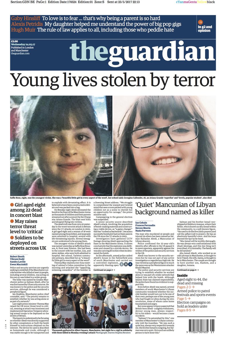
However, when we look at how 'The Guardian' has told and portrayed the same story, we can see a strong difference in how it has been formatted and shown, along with the similarities and differences of the portrayal in the 'Daily Express'. As 'The Guardian' is a more open/ left-wing newspaper, we can see how any potential racism or degrading of communities has been drastically reduced and instead focuses solely on the story. We can use the masthead "Young lives stolen by terror" as evidence as the masthead is simple and straight to the point, and does not include degrading insults like the 'Daily Express' subtitle. This allows the judgment and conservative ideal to be absent as it raises awareness as to how the vast majority of Islamic faith does not agree or share ideas with ISIS and reduces any potential racism to be found in the advert. A critic, however, could still attempt to prove it isn't entirely ethnicity equal as all the people found on the front cover are Caucasian women, so †hose of other cultures are of less importance in the story, thus while the sexism has been avoided, the racism hasn't necessarily.

Plus, similarly to the 'Daily Express', 'The Guardian' has also used the primary image of a close-up of 8-year-old Saffie, who perished in the terrible tragedy, as their main selling point. This has been intentional because as humans, we have an innate response to care for children, thus seeing a child die, the audience's sympathy and glumness increase tenfold as it plays on our heartstrings as an audience, and so we are prompted to read and feel more tragic about the event.


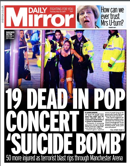
Lastly, let's look at how the 'Daily Mirror' has portrayed this story as they are one of the most open, reformer, left-wing popular newspapers in England. Unlike the 'Daily Express' and 'The Guardian', the 'Daily Mirror' have not used Saffie as their primary case study and selling point, instead, the CVI shows a long shot of 2 female police officers aiding a wounded teenage girl. This still allows the wounded youth selling ideal to arise, but it allows a younger audience to connect more personally with this story, therefore allowing their target audience to broaden. Plus, as the CVI shows a coloured male police officer, we can sue this as evidence that the 'Daily Mirror' has been more multicultural in their presentation of the attack.

And as we read the story, there is no insulting of the race of the suicide bomber, nor any racist or discriminatory remarks at all. Much like 'The Guardian' their text such as their masthead "19 dead in pop concert 'suicide bomb' has ignored any degrading insults and name calling found in the 'Daily Express', thus fulfilling their tagline of "Fighting for you" as they have proven to create an equal look at the tragedy, and are more factual and less idealised.