Friday, 15 December 2017

Applying Media Theory to Advertising Media

Applying Media Theory to Advertising Media - Rhys Wallett


When using Emilie Autumn's music video for Fight Like A Girl, found in her 2012 album of the same name as an advertising product from which we can apply Media Theory too, we can see how the only music video of Emilie Autumn is rife in semiotics, iconography, and representation which would allow many media theorists (Hall's and Gauntlett's theories in particular) to use this to support their viewpoints.

Starting with Hall's Reception theory, you could argue that Autumn's dominant view would ideally be that an audience would be alarmed by the extreme difference of this music video compared to others, and so would check out Autumn's other works and purchase her albums. However, it is easy to assume how an oppositional viewpoint would be they would be deterred by the violence and Gothic layout to the music video and would be fearful of Autumn and hence would not support her.  Plus, Autumn has been able to effectively encode many ideas which link to her brand image which an audience would effectively decode, such as how we can use the wide shot of Autumn with which the mise en scene shows her performing in uneasy clothing, which gives of a disturbing brand image. In fact, there is an abundance of evidence to support how the music video portrays Emilie Autumn's brand image as being creepy, and thus allows an audience to use Hall's theory to decode ideas about her. Such as how in the duo mid shot towards the end where the mise en scene shows the imprisoned Emilie Autumn being forced to make out with the prison guard, with the clever graphics of "W14A" being effective intertextuality to Autumn's novel The Asylum For Wayward Victorian Girls shown in the background. This scene would be typically decoded by the audience as horrific, uneasy and unethical and so gives the audience the impression of her music being niche and that of the Gothic genre and thus would ideally either create a Dominant or at least Negotional response from her target audience which would both result in checking out the artist and the other albums with examples being Opheliac and Your Sugar Sits Untouched .

Meanwhile, when applying Gauntlett's Identity Theory to Fight Like A Girl, we can consider how the producers have effectively shaped Autumn's identity as both a person and a producer and what emanates what pragmatics. For example, Autumn has decided to make all the females in the music video as either being mentally insane patients shown in the close-up shot of Autumn being strangled by the male guard at the door where the background shows the mise en scene of fellow mentally insane women being violently abused while they all wear rags which would be considered to be prison uniform and have messy hair. Or they are represented as wards of a mental health facility shown by the duo mid shot of the two wards which the mise en scene shows them looking up at unison using indirect mode of address. As these representations are negative primarily if an audience's 'Pick & Mix' of media was limited to propaganda like this with Gothic, unsettling images like Fight Like A Girl then they could identify women as either being mentally insane or strict wards, and if they aren't insane they're homosexual shown by the duo shot of the wards being sexually aroused when seeing the mentally insane patients change, therefore this is hugely negative as it creates a colossal dichotomy of status amongst men and women so prevalent in the media today. Therefore if they limited themselves to media similar to music videos like this, they will be convinced men are the sane leaders of the world, while the women are mentally insane nuisances which would cause sexist ideologies to be implanted in the viewer's brain, despite the seemingly sounding feminist song.


Meanwhile, when we apply Barthes', Halls' and Gerbner's Media Theories to the trailer for the 2005 production of Pride & Prejudice we can see how the infamous novel by Jane Austen which has been adapted into movie form allows their effective media theories to convey the desired details of the respective theories.

When looking at Barthes' Semiotics Theory, we can see how they used the cliff shown in the wide panning shot which shows the main character, Elizabeth Bennet, using indirect mode of address which the mise en scene shows her standing on the end of a colossal cliff to add effect to the trailer. This is shown by how the pragmatics of a cliff is the brink of mental consciousness and sudden end. Thus, this allows the audience to infer the idea that Elizabeth is contemplating huge personal dilemmas and stressful thought which they will then link to her inner battle about whether or not she loves Mr. Darcy which advances in the audience's devotion in their relationship. Plus, you can use the semiotics of the weather too in the trailer for Pride & Prejudice as an example shown by how in the mid shot of Mr. Darcy and Bennet arguing via "Do you expect me to rejoice in the inferiority of your circumstances?", in the layout of the shot, there is the visual code of rain which allows connotations of rain (which are melancholy, misery and degradation)  to be added into this scene which an audience could infer as to how there arguing is causing deep sadness for them both as they love each other. In contrast, sunlight has also been effectively used in this trailer shown in the mid duo shot of the two with the sun's light shining behind them as they are about to kiss. This is extremely effective as the pragmatics of love as redemption, savior and joy and therefore adds to the effect of the scene where they acknowledge there love for each other and allows an audience to be further emotional and happy about their success in love then if the sunlight wasn't there.

Next, when looking how Hall's Representation Theory, we can see how similar to Barthes' theory, signs such as the opening wide shot which the mise en scene shows a horse and carriage allowing the codes of the 18th Century to arrive in the trailer, as contextually they were the primary form of transport in the 18th Century.  Therefore, this forewarns an audience whom would not have already been aware of the context of Pride & Prejudice that the movie will be set in classical times. Plus, we can use how the stereotype of men back in 1797 create meanings of the community, as we can see how the stereotype that rich men wear suits is shown through the wide shot which the mise en scene shows Mr. Darcy in the center using direct mode of address and wearing a penguin suit. Thus, this allows the meanings of the stereotype to be brought into the movie as it gives the men meaning in the sense that their purpose in the world is to amuse, dance and celebrate while looking sophisticated and formal at all times. We can also see how the fact that stereotypes were based on inequalities is a tradition still being upheld in this trailer for Pride & Prejudice as there is a definite sense of power difference amongst Elizabeth Bennet and Lady Catherine de Bourgh shown in the close up scene of the two women's discussions where Lady Catherine says "Do you think his union can be prevented by a young women of inferior birth?" showing how the stereotype that the rich dominate the poor is shown in this, which is based off an inequality of class and thus, shows how stereotypes reducing people is shown in this trailer as Lady Catherine's class allows her to be cruel and pompous enough to insult Elizabeth purely based on class which reduces Elizabeth's character to working class.

Lastly, let's look at Gerbner's Cultuation Theory and how it applies to the trailer for Pride & Prejudice. When you look at how 'Repetition of Representations' has been used in this, you could argue that this enforces the classical idea that women back in 1797 had a primary purpose of looking for a man, shown by the narrator says "In an era when marrying a man was the most a women could hope for." which is, while contextually true, still regressive towards the representation of women as this idea is similarly repeated in the trailer for the 2002 production of The Importance Of Being Earnest  and the trailer for the  2011 production of What's Your Number?. Therefore, as this idea that women's sole purpose is to marry a man, this changes the audience's perception of women in a regressive way, and instead of encouraging how independent women are, it enforces regressive stereotypes of women and so the audience's perception of women could be changed to the ideology that a women's sole purpose to live is to be wed to successful men.

Friday, 8 December 2017

Extension Task: 8/12/17

Extension Task: 8/12/17 - Rhys Wallett


In the trailer for the movie Dorian Gray released in 2009, we can see how the trailer has been similar and different than that of the film poster released alongside it to promote the movie and how the trailer has effectively used visual codes, semiotics and other media techniques to attract audiences.

For starters, when considering the presentation of the macabre in the trailer and how the same theme is shown in comparison to the film poster, we can see how the supernatural is present in the trailer, with an example being in the wide shot which the mise en scene shows a butler holding a metal plate from which Dorian Gray's true appearance gleams off, causing him to go into shock shown by the close-up shot of the glass smashing as a result. This is intriguing as this can link to the essential picture which is vital to the story, which has no link in the film poster. Furthermore, in the film poster, the macabre of the eponymous character Dorian Gray is shown in an entirely different manner, with the mid shot of Dorian Gray using direct mode of address and the post-production technique of having his torso deteriorate from him and have the black crumbles move towards the fearful manor being the evidence of this. However, in the trailer, we see no physical evidence of his body singing away from him in this matter, and therefore an audience would be able to identify that this post-production technique is, in fact, a visual metaphor of the corruption of Dorian Gray's soul as Lord Henry Wotton's persuasion and Dorian's repressed sexual desires result in his demise in Dorian Gray. 

Furthermore, we can use the horrifying and extremely Gothic manner shown in the wide shot of the background of the film poster as a difference between the poster and trailer as in both the trailer for, and the actual movie Dorian Gray, there is no reference to a manner of Gothic design and therefore the film trailer is misleading in the premise of the plot of the movie, which the deteriorating torso of Dorian also supports. I feel that this has been intentional as the vagueness of these indications of stereotypical horror allows a secondary audience to become intrigued by the complete sinistral of these iconography's and so will be prompted to watch the trailer and the movie as the juxtaposition between the trailer and poster ion this sense may have been intentional as it will cause a now stressed audience to watch the movie to discover whether or not the iconography of the macabre shown in the poster will be present in the movie or not. This proves that they are using sheer curiosity as their advertising technique, which is a common but effective technique in trailers and advertisements. 

Secondly, when looking at how semiotics have been used effectively in the film poster and trailer and how they differ, we can infer further differences between the respective media products. Such as how in the film trailer, for example, we can use the semiotics of objects such as the essential painting, shown in the close up of the picture's eyes through which the mise en scene shows the star vehicle Ben Barnes caressing with his index finger. The semiotics of this is of true importance, as the pragmatics of portraits are memory, remembrance and ideality, by which I mean that a typical portrait would never age and remain in its form forever, however as any The Picture of Dorian Gray fan would know, that exact point is the most major point of the play and shows the corruption and consequence if we embedded our ageing to a portrait. Therefore these semiotics are effective as it allows the pragmatics linked to said semiotics to be exploited for the movie regarding the picture which surmises the majority of the plot. However, when looking at the semiotics in the film poster such as the red dress which is shown on the character Emily, we can infer other meanings to the movie as a result. The pragmatics of a red dress are class, wealth and most importantly, sexual desire as psychologically, humans subconsciously consider a red dress to be the most sexually desirable than a dress of another colour. As a result, it allows an audience to ponder why the producers decided to have the late love interest, Emily Wotton dressed in a dress which is a blend of wealthy and promiscuous, with a potential argument being as to how Emily causes Dorian to fall in love with her with her colourful personality and could be a close to Dorian's sexual success and attraction which increases as the movie progresses, her personality is an absorber of Dorian's attraction and devotion, hence why the semiotic of a red dress has been included to give a potential foreshadowing of the emotional envelopment Emily will have on Dorian towards the end of the movie. 

Next, we can use post-production and visual techniques such as the graphics used in both Dorian Gray's trailer and poster to emanate similarities and differences respectively. Such as how in the film poster firstly, we can use the main use of the graphics of the title "Dorian Gray" written in the decorative font. The said decorative font is intriguing as it has tendencies of the serif font, proven by the little add-ons to the text, has a subtle hint of block cursive font shown by the drag of the end of the 'r' in Gray, yet overall the font gives off a certain Gothic look. This is effective as it foreshadows a Gothic/thriller type movie and juxtaposes from the frilly cursive font which is commonly associated with either classy or comedy movies. Plus, a similar but brighter font has been used for the poster's tagline "FOREVER YOUNG, FOREVER CURSED."  which is also effective as the vague quote allows pragmatics of mystery and suspense to be given to the poster which represents the movie, allowing the poster to be mysterious which once again links to the audience technique of curiosity to attract potential viewers as their target audience will be interested in the vague quote and will be tempted to watch the movie to find out the context behind the statement if they are not familiar with the plot for Wilde's novel The Picture of Dorian Gray,  of which it is based on. 

Similarly, in the trailer, the same Gothic, decorative font has been used for nearly all of the lines used in the trailer with a few examples being "His Face Unforgettable", "Forever Perfect" and "Forever Cursed". However this trend of their unique font is broken at the very end when they reveal the title "Dorian Gray", when at the start of the showing of the title graphics, the font is identical to that of the previous statements, however the title begins to wither and decay further on in the trailer which is effective as it is a link once again to Dorian Gray's withering and corrupting soul and has pragmatics of supernatural, impurity and horror, which also could be argued as an odd form of establishing shot, as while it doesn't establish the set of Dorian Gray, it establishes the genre of the movie: Fantasy Thriller. 

So in conclusion, there are arguably numerous similarities and differences between the film poster and film trailer for the 2009 movie production of Dorian Gray and how the producers have decided to use different specifics of stereotypical goth in the respective forms of media to provide the right level of context and foreshadowing to the plot in both to allow the intrigue of audiences to be just at the right consistency to convince them to purchase access to the movie.  

Tuesday, 5 December 2017

A Look At Film Media Based On Work By Oscar Wilde

A Look At Film Media Based On Work By Oscar Wilde - Rhys Wallett


When analysing the film poster shown above for the British film Dorian Gray released in 2009 (based on Oscar Wilde's The Picture Of Dorian Gray), we can infer how the producers have effectively used and juxtaposed from stereotypes of the fantasy/thriller genre Dorian Gray fits into.

Firstly, when looking at the visual codes such as layout and design, we can use the effective background shown to indicate target audiences, in which case is Englishmen, particularly those who reside in London. This is evident by how in the back of the wide shot, we can make out the shape of the infamous tower Big Ben which is commonly associated with London. This, therefore, tells us that the target audience is people who live in - or know a great deal about - English culture. This has been included, as the novel it is based off is set in Victorian London, and so they are referencing the novel and proves to Oscar Wilde fans they are sticking close to the novel, satisfying this audience expectation that Wilde fans would have. However, this is juxtaposed by the inside reference of Emily, who is the secondary character which the mise en scene shows her wearing a red dress which contrasts her father, Henry Wotton beside her, and both links to and juxtaposes the eponymous character, Dorian Gray as evident by the mise en scene of Dorian Gray, with the visual codes of costume highlighting his red scarf with matches with Emily's dress, but his black coat linking to Lord Henry Wotton. This is an inside reference which only proper Wilde fans would understand as in the novel, Lord Henry Wotton has no child and so an unaware audience would assume it is on par with the script, however, advanced Wilde fans would be able to recognise this is not the case.

Furthermore, we can prove the genre of Dorian Gray is fantasy/thriller by the layout on the other side, with the mise en scene showing a darkened, sinister fortress with a dragon sigil on a statue as the CVI for the fortress. This allows pragmatics of fear and horror to emanate from the poster and allows the film to be advertised as belonging to the thriller category. Plus, the star vehicle Ben Barnes also shows themes of thriller and macabre in numerous ways, the most blatant of which is in his mid shot with which the mise en scene shows his torso being flaked and singed away from him in a diagonal line across his torso. This is very intriguing as it is in itself, a visual metaphor for corruption and degradation, thus fitting in the category of horror, particularly the mental corruption commonly associated with the horror genre. This USP of the poster is so unique and effective however that it would not be foolish to argue that the deteriorating torso is the poster's 'hook' as it is in itself a virtual cliffhanger as their target audience would be intrigued to find out why he is corrupt, and how he becomes this degraded and broken. Plus, it's also interesting that they have called the movie Dorian Gray, unlike the novel it's based off called The Picture of Dorian Gray. This would have been made intentional as a Wilde fan (or an audience who would have read the infamous novel) would be aware that plot-wise, the majority of the plot revolves around Dorian Gray and his infamous picture, with which he trades his soul so that the picture of him will age, yet he will not. However, the producers and advertisers have decided to make absent any link, reference or suggestion towards his picture which will result in his demise. This, therefore, allows them to make a cliffhanger in itself, as their target audience would be literate lovers with an acceptable knowledge of Wilde's work who would generally be older, therefore the absence of any indication of a painting is effective, as this target audience will be curious as to whether or not they will adhere to the novel and revolve the novel around said picture (which they do but not nearly as much as the book would have intended.) and so will pay to watch it to see if the plot will match, they have used sheer curiosity for correct closure from the audience's behalf to sell their film product, which is a very unique and interesting selling gambit.

Star billing/ Star Vehiclising has also been used in this film poster which is evident by not only the eponymous character played by Ben Barnes, whom a large audience would be able to link to his previous infamous role as Prince Caspian in the hugely successful The Chronicles of Narnia: Prince Caspian  therefore, they have used the famous actor to allow audiences to recognise Ben Barnes and use their fond knowledge of Ben Barnes to assist in their decision to purchase entry to watch the movie.
In addition, star billing has also been used in the text that reads not only "Ben Barnes" but  "Colin Firth" as well in serif font above the title. Colin Firth has also been used as a marketing gambit as shown as a secondary image in the mid shot at the back, using direct mode of address. This has been effective as a typical British audience, especially the target audience explained above, would be aware of Colin Firth's numerous and famous works with examples being Nanny McPhee, Kingsman: The Secret Service and The Importance of Being Earnest which will be analysed below. The last example is especially important as Wilde fans of the same category would have assumedly watched the 2002 production of Wilde's infamous comedy The Importance of Being Earnest which also stars Colin Firth as the main character, therefore the decision to use Colin Firth in another film product based on Wilde's work will allow pre-roped Wilde fans who like Firth to be drawn in to this new movie released in 2009, therefore they have used the cast as an effective way of advertising.

Lastly, the absence of expert criticism in this film poster is more effective than if it was included as that in itself is a Mark of Quality. You could argue that the decision to leave out expert criticism means that the film is so good, you don't need to listen to other people's opinions due to the film being great anyway. Plus, while the movie is stand-alone and independent, it is in its own weird way, a 'sequel' of sorts to their 2002 movie The Importance of Being Earnest which is based off the same author, and so the fantastic reviews from that movie would be carried over to this new movie and therefore the mark of quality is that if you loved the first adaptation of Wilde's comedy, you'll also like this adaptation of Wilde's infamous horror and thriller The Picture of Dorian Gray. 


However, when we analyse the film trailer for the 2002 production of The Importance of Being Earnest, we can see that extremely juxtaposing techniques have been used effectively in this trailer and see how factors such as audience expectations, genre indications and Lexis have been used extremely different than that of Dorian Gray to promote Wilde's most famous comedy.

Firstly, we can infer target audience from this film trailer and I will argue that said target audience is late youth, middle-class audience who would be at least social demographic class A. The evidence
for such is how the voiceover tells us in the wide shot with Colin Firth using indirect mode of address in the low-angle shot of him staring at renaissance paintings by "And perfect manners", which is context to the plot and premise of the movie. This proves how the target audience would have a sense of aura about them as the target audience would adhere by and appreciate the morals portrayed in this advert, and as that links to wealth and decency, it would not be foolish to assume that the target audience would have access to money.

Further evidence can be shown in visual codes such as iconography in the advert when the title of the movie is revealed in salmon pink fancy cursive. This is effective as the cursive font is commonly associated with wealth and so the decision to use one of England's classiest fonts tells us that this movie would be intended to those of middle class and those who have had/ or are in expensive education. Age wise, you could argue how the target audience is wealthy 30 years old to the elderly with the narrator saying "But this isn't Jane Austen's England." as this joke would only be apparent to those who are highly educated in classical literature and can appreciate Jane Austen and her infamous novels, therefore the target audience would not be ideally youthful teenagers as they would stereotypically be aware of classicism and literature enough to appreciate the inter textual reference, instead those of considerable years of age will have had time to learn about said history.

When looking at genre indications, we can easily infer that The Importance of Being Earnest  is a comedy, in particular, Epigrammatic humour which is supported by when Algernon the insulting but clever declarative "The only way to behave to a woman is to make love to her if she's pretty and someone else if she's plain.". This sentence tells us that Epigrammatic humour has been effectively used in this film trailer as they are using witty statements about morals to invoke laughter from the audience's behalf, which is a very classy and reserved for of humour, way more austere than Juvenile humour for example. This can also link to audience expectation as their target audience would be similar to that of Dorian Gray: literate civilians who have moderate/advanced knowledge of  Oscar Wilde and his work and therefore as they would knowledgeable of the class and morals in Victorian England in which it is set, and further away of how The Importance of Being Earnest  is a satirical comedy, they would expect the movie to be a spoof of class, presentation and social views, therefore the use of said witty statement allows the audience expectation of the movie to be light-heartily classy is satisfied.

It can also be proven to be a comedy through the audio codes of the film trailer, as throughout the trailer we can hear a non-diegetic opera of sorts being played constantly, with the lead being a violin solo. As the song played is one of typical class and the music being enjoyable and happy, allows a more joyful sound to the trailer to be made which assists in telling the audience the obvious point that this movie product is comedic, and their 'promise of pleasure' is that you will get laughter, humour and satirical joy from this Epigrammatic satire, which is widely considered Oscar Wilde's masterpiece of a comedy.

Tuesday, 28 November 2017

Analysis of Print and Moving Image Adverts

Analysis of Print and Moving Image Adverts - Rhys Wallett


In this ad from "Salvations Army", we can decode how they have used certain media techniques to promote this charity which care for the poor. For starters, we can analyse how they have deeded to use the colour rule of three with black, red and white which have pragmatics of nuance, simplicity and tradition. Therefore, this allows a juxtaposition from tradition and abstractness to be shown in the advert as the abstract can be argued by how Salvation Army have gone for the unusual decision to make the CVI a small collection kettle which is insignificant enough to allow lots of white space to be shown in the ad, connoting class.

Class can also be shown with the decision to make the main headline which says "When you put money in our kettle, expect change." be written in serif font, which has connotations of class and sophistication. Yet this decision to make the advert sophisticated is interesting as a typical charity do not care about formality or manner, especially Salvation Army who care for the poor and homeless, thus the class act is intentional to tell their target audience charity is not the grunge, displeasing stereotype we commonly associate with it, and how charity deserves to be respected and listened to.

Furthermore, the choice to use a quirky yet powerful pun in the heading (with the pun 'change' being a link to change in the world and change from your pocket) is effective as it allows a 'riddle' of sorts to be embedded in the title, giving them the audience pleasure we receive when we decode a hidden message in an advert, which will then lead them to consider the seriousness of the situation and therefore they have used the puzzle of the pun to grab an audience's attention to donate towards their charity. 

Simplicity is a huge part to this advert and its effectiveness. There appears to be no demonstrative action, nor intertextuality, or even applying to fear or desire many advertisers do. Just a red kettle with a powerful heading and some disclaimers at the bottom. The simplicity is effective as it ensures that an audience does not tire of, or get confused by an advert that would be more complex, and is able to use the white space to grab an audience's attention as it is an easy peruse, yet still allowing iconic representation of the charity to be effectively portrayed with their USP being a red kettle as the CVI.

Plus, they have also broken the rules of the 'soft sell/hard sell' paradigm in this advert as stereotypically, charity adverts use hard sells and leech of the audience's feelings of melancholy, empathy and woe to push them to donate towards their cause, however in this advert, hard sell does not prove to be used as there is nothing an audience would feel especially glum about, nor it is a soft sell as it also prevents feelings of pride and self confidence to be inherited for the audience, it fits into neither category. I feel this is effective as it allows cold facts to be the focus and dismisses the emotional response they egg from the audience, allowing a straight up and therefore effective advert to be produced and distributed.


In this Boohoo TV advert however, from their advertising campaign "WeAreUs", we can infer different advertising techniques used to effectively sell their product and see how it primarily differs from the advertising techniques used in the Salvation Army's print ad.

Firstly, demonstrative action is shown in this advert in the close up tracking shot of the women walking in her wedges from Boohoo. This is effective as it allows there products to be shown in use, thus highlighting what you would look like in them, which would give an audience the knowledge and security that there products are usable and pretty when worn, and therefore will provide a target audience with insurance when purchasing their products.

Plus, we can also use visual codes such as the background in the advert to infer effective sales techniques, especially in the first half of the advert which the background proves to be the ideally blue, sunny and cloudless weather, which is considered the most desirable weather by the majority of the audience which creates a subtle hyperbole which states that if you wear Boohoo, you will be surrounded by sun and joy and be as happy as the model's in the advert. Plus, it also taps into the 'fear and desire' rule used commonly in advertising as it uses the 'desire' straight men and homosexual women will feel when seeing these models, especially the mid shot of the brunette model which the mise en scene shows her exiting a swimming pool in a bikini and smiling broadly. This sexual desire allows Laura Mulvey's male gaze theory to be shown in the advertisement and will attract male customers for Boohoo Men and the target audience of females as they 'desire' to be like these happy, beautiful models.

Plus, they also prove to use the 'soft sell' technique so commonly found in fashion ads as the decision to make all the models happy, wealthy and successful tells us they aim to make the audience feel somewhat bad about themselves as they are not these icons to aspire to, therefore if you purchase Boohoo's products, you will magically be as successful as these women and have their lifestyle, as they are also advertising the 'glamour' lifestyle in the advert. Yet on another note, their decision for iconic representation is rather interesting as while their particular products are shown constantly throughout the advert, their branding is not visible till the very end which allows a target audience to get excited about the products shown and finally given the brand from which they can purchase these products, creating a pique level of intrigue before flashing the brand image. 


Monday, 27 November 2017

Write up of our 'Star Vehicle' Media Project

Write up of our 'Star Vehicle' Media Project - Rhys Wallett


https://doc-14-58-docs.googleusercontent.com/docs/securesc/km2tgmndftsaj5j1ikovgtjhl6j3r4jv/h2u1728671lidp088526ls9emnbqu7vc/1511805600000/02371770692509184141/02872537224512968273/1t5cThbO1Zrc6R70m8_J6hfTOrX8cxD45?e=download&nonce=5dgei1kvqmvb0&user=02872537224512968273&hash=otrqejp9e30iqspav0jb1gf7qvhioqtv


For our media project, we had to choose a music author and see how their music videos contributed to their brand image, the reason for certain inclusions and their effectiveness and how an audience will infer from these music videos and what opinions they will form. Our group decided to go with the pop/indie phenomenon Imagine Dragons as we felt that all their music videos were so abstract and different from each other respectively, there would be an abundance to say about each specifically. While we did produce a video explaining vaguely what occurs in their 3 music videos "On Top of The World", "It's Time" and "Thunder" and how this links to their brand image, this write-up allows a more critical look at these music videos to form a further advanced interpretation of these music videos.

If we start with the music video for their hit song "On Top of The World", which was released in their 2012 album Night Visions, in our video production we argued the following bullet points about the music video:

  • Both narrative and thematic
  • Satirical by exploiting American conspiracy
  • Quirky yet humorous
  • Shows dichotomy/ togetherness in community
  • Binary opposites amongst star vehicles

For quick evidence, the first bullet point is proven as being narrative as it follows all four members of the band with a close up of each of them getting ready before leaving the house, a wide shot of all 4 walking on a zebra crossing on their way to the set and wide shots of them leaving the fake moon landing set. However it also proves to be thematic as later in the music video, we see a high angle shot of a crowd holding the fake astronauts in the air cheering. The second point can be argued is that they're using the conspiracy that the moon landing was fake to be the premise of their music video, and so this blatant mocking of the event proves they're being satirical of America. The third, quirk wise its shown by the extreme background of each 4 members, especially with Ben McKee where his opening close up shot has the mise en scene of wearing an ugly beige suit, flowery shirt and dark yellow tie, which together has pragmatics of abstractness, quirkiness and boldness, therefore his abstract costume adds quirk and humour to the music video. The fourth point is evident with the starting 4 close up's of the individual band members, with Dan being a successful businessman/ family man, Daniel being a hippie, Ben a pompous nerd and Daniel Platzman a cool motorbike rider, the four polar opposites of categories men can fit into. Yet how they all come together of the wide shot of all 4 of them in their astronaut gear walking down a corridor shows how they have all come together to form a sacred bond and this also provides the same evidence for point number 5.

For their brand image, "On Top of The World" allows their brand image to be quirky, funny and innovative while calling out hushed topics as this is shown by the polar opposite and the oddity of all 4 respective band members, the scene of a child which the mise en scene shows him wearing a tin foil hat allows a comedic aspect to be in the music video and the decision to exploit the Fake moon landing conspiracy shows they're confident enough to poke fun at America for their profit and cheeky persona.

However, when we look at their other music video "It's Time" from their album Night Visions, we get completely different decisions for their brand image due to its complete difference to "On Top of The World." In our video production, we stated that "It's Time" was:

  • Juxtaposition between audio and visual (Video is gloomy, song is happy)
  • Thematic (And also performance) music video
  • Close up's, wide and mid shots used
  • Use of mono to give bleak pragmatics

The first point can be argued as to how the mise en scene of the background is black and white and cloudy, plus with the fact they are in a desolate area, has connotations of sombreness, isolation and melancholy. However, the beat of the diegetic music is quite upbeat and happy, creating a discern between the happy and gloomy parts of the video. The second point can be argued as to how it is a tie of performance and thematic as there is no real narrative to them walking in a desert, however when they bust out into song, it allows it to have a performance aspect and the Visual in the background such as the clouds opening at the end of the music video allow it to be thematic. Point three can be proven by a) the close-up shot of Dan holding the glowing rock, b) the wide shot of the 4 band members walking westwards on a hill and c) the mid shot of Dan singing to the tune. And 4 is self-explanatory, as the music video is in black and white, this allows the connotations of gloominess and bleakness to show as black and white have pragmatics of sombreness.

Brand image-wise, I feel that this music video allows them to have a more philosophical and aspiring look shown in "On Top of The World" as the walking in a field for a form of redemption allows them to have the 'troubled past' persona many band artists use to sell their product (eg: Emilie Autumn) which allows feelings of sympathy and thought to be had for the audience, allowing the said audience to think of Imagine Dragon's as aspirers and troubled.

Finally, when looking at their music video for "Thunder" from their most recent album Evolve, we can get further and still stranger points to back up their complex brand image. In our video production we argued that "Thunder" was:

  • Could show the abstractness in urban life
  • Mono except for the album's cover (Advertising album)
  • Copied "Lady Gaga's" type of music video

The evidence for the first point is how the background for the music video "Thunder" is set in an urban layout, and the decision to have a lot of alienated characters acting strangely in the city could show the 'aliens' living in the city as if living in the city is almost macabre. The second is again straight up, the music video is black and white except for 3 bolts of colour (Yellow, Cyan, Light Blue) which are the prime colours for their front image for their album Evolve and is, in fact, intertextuality to their other music video"Believer" also in Evolve where those same 3 colours are the primary background within, which a true Imagine Dragon's fan would be able to spot. And the last point can be argued given how Lady Gaga's music videos are generally abstract and disturbing in a good way, with the same idea being used herein "thunder" with having supernatural humans performing in the empty streets of a city.

When looking at what this adds to their brand image, an audience would be able to identify them as quirky and fun similar to their primary brand image in "On Top of The World" as the innocent yet confusing aliens who contort and dance throughout the city allow us to feel honoured by the bizarre of the situation, portraying them as abstract and creative as a band.

In conclusion, based on a critical look at these 3 music videos, Imagine Dragon's have gone for the likable approach in their music videos, with the abstractness, complex emotion and satire woven in them respectively to allow an audience to look at them more like "music and millennial icons" than intense and gritty, allowing this sympathy to be a catalyst for the said audience's to purchase their album's.


An Observation of The Representation of Age

An Observation of The Representation of Age - Rhys Wallett


In the media industry, there is a definite dichotomy between the different age groups, with stereotypes of all age groups limiting the potential character availability actors of said age groups can fulfill. For example, it is very rare that you would see elderly people dancing in a club unless it's for comedic effect, or a young person reading classical literature as said examples juxtapose the stereotypes associated respectively. 


If we are to use the trailer for Season 3 of Grace and Frankie as an example of the representation of both young and old people, we can see how Netflix have both tried to reinforce and subvert stereotypes surrounding the community, with a strong subversion being in the scene when the eponymous character Grace says "We make vibrators specifically designed for the older woman." as stereotypically, elderly women are supposed to have next to no sex life, partly due to the torso deteriorating but mostly because they're supposed to have no sexual desire. Therefore, the fact that the two stars of the show are creating a company which provides satisfaction for elderly women is a kick to the system and tells the audience that women of an advanced age still think similarly to the youth, and have the same 'needs' the youth feel they require.

Yet in that very same speech, while positive, Netflix has also represented the elderly as problem swamped and delicate such as how their product must "take into account their arthritis." and "tender vaginal tissue.". This can be polysemic however as a critic could argue that this represents the elderly (woman) as fragile, broken and wound down as they need these additions to allow the purpose of their product to be more easy to use and inclusive. On the other hand, a fellow critic may interject however that this is progressive in terms of how elderly woman are represented, as it shows how the elderly need to be considered more in our society and are not the conservative, dependant burdens millennials would stereotypically view them as.  

Let's continue our representation of the elderly woman through the scene which a mise en scene shows a duo shot of eponymous character Frankie and Brianna as in the medium close up, we see Frankie's costume having pragmatics of faith, ritual and casual due to her unflattering and open t-shirt, therefore this allows the ideology that the elderly are uncaring about their appearance  to be conveyed in the show, reinforcing the stereotype with similar description. This, therefore, tells their target audience to care less about how they dress, however you can also juxtapose this representation with the representation of the eponymous character Grace Hansen especially in the mid shot of Grace on the sofa in the business incubator which the mise en scene shows Grace wearing a blue suit which has connotations of respect, wealth and success. Therefore whatever stereotypes can be formed of elderly women in Frankie can be disproved with Grace.

However, when we look at how the youth are represented in Grace and Frankie, we can pull out more unusual decisions on Netflix's behalf on the representation of the young, especially the late 20's/ early 30's category. If we are to use Briana as an example, we can see in the park bench scene that she is wearing a suit of black and white which connotes sophistication and success. therefore Netflix has decided to make Briana's character belong to social demographic Class A which is interesting as this class is typically reserved for the middle-aged doctor and lawyers, earning thousands from being experienced in their chosen field. Therefore, Briana allows the ideology that young people can be prestigious and successful to appear, creating a progressive representation of the young and subvert the stereotype that the young are foolish, idiotic and lazy.

Plus, we can use the long shot with Mallory pushing a martini glass towards Grace to calm her down as an effective representation as the action has connotations of familiarity, as if certain it would be effective to stop Grace from attacking her meat, which is true. This shows that Mallory's character has adapted to her mother and learned how to evade her, which shows how she is smart enough to play her mother. This is effective as it can be argued as it reinforces the stereotype that young people care for the elderly and are smart enough to know how to effectively, therefore creating a progressive ideology for the youth. 


Friday, 3 November 2017

A Look at the Newspaper Coverage of the Manchester Terrorist Attack

A Look at the Newspaper Coverage of the Manchester Terrorist Attack - Rhys Wallett


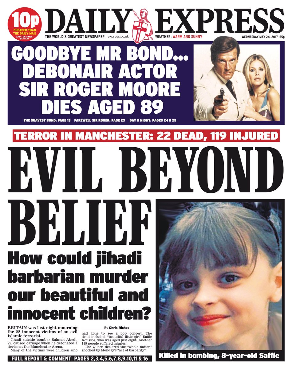
When looking at how the popular British newspaper companies portrayed the harrowing tragedy which happened in Manchester on May 22nd, 2017, we can see as to how different newspapers have portrayed this, and how their political view and their place on the right wing / left wing spectrum has influenced this to see how powerful news companies control how we would view this tragic loss. 


If we are to start with the 'Daily Express', who are well known as a conservative, right-wing newspaper who have more traditional ideas, we can see how their choice of format to tell the tragedy has been created in a way in which themes of racial discrimination can be shown, which is hugely regressive for our society. Let's start with the subtitle on the front page, where the rhetorical question "How could jihadi barbarian murder our beautiful and innocent children?". This is a hugely regressive and negative statement, rife with racism and discrimination, such as how for starters, the Daily Express has chosen to call the people responsible for the attack "jihadi barbarian"'s, which is a hugely offensive statement for those of Muslim faith and are not part of the extremist Muslim sub-community. In addition, the decision to refer to children like Saffie as "our beautiful and innocent children?"can also be considered offensive as "our" is referring to British children, therefore it would not be unreasonable to assume that the Daily Express is attempting to say how British youth are way more beautiful and precious than those of different faiths, plus the fact that the secondary image shows a Caucasian girl, this can have subtle reference to how the Caucasian race may be the purest of races, an extremely horrific and barbaric perspective. This is extremely plausible however as the Daily Express newspaper has traditional, conservative values which include a dichotomy between the races. On a side note, the fact that the 3 people found on the front cover are of the Caucasian race, which can show anti-diverse ideals and how the Caucasian Bond is referred to with respect with "Goodbye Mr. Bond", while the only reference to other culture is "barbarian".

Furthermore, we can also prove they have attempted to attack other races and ethnicities when telling the story with the tertiary title "... evil Islamic terrorist." The unnecessary inclusion of "evil Islamic" shows racist motives as it described the entire Islam community in a Machiavellian manner, which is completely inaccurate and false as it was a sub-community who have Islam related faith. Therefore, a primary audience (who would be traditional, middle-aged, white, straight men) would form negative opinions of those of Islamic faith which could potentially grow into a prejudice of all those of different culture.


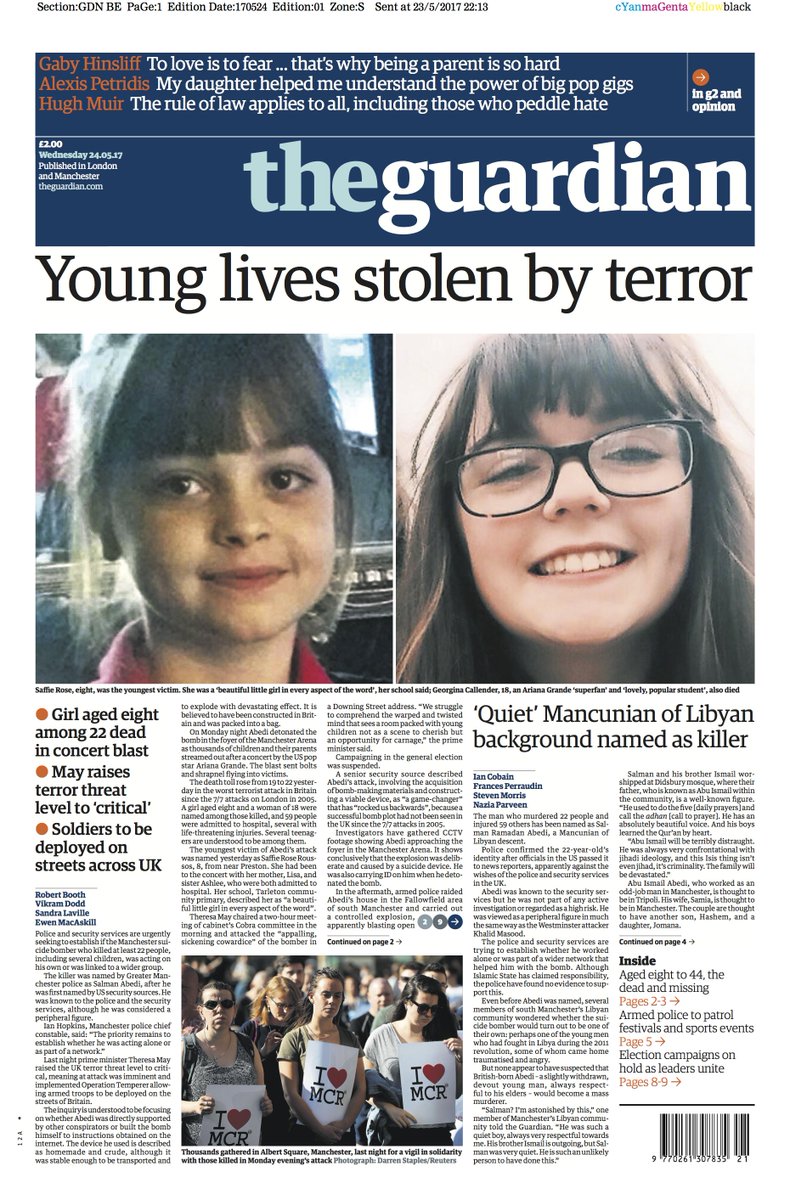
However, when we look at how 'The Guardian' has told and portrayed the same story, we can see a strong difference in how it has been formatted and shown, along with the similarities and differences of the portrayal in the 'Daily Express'. As 'The Guardian' is a more open/ left-wing newspaper, we can see how any potential racism or degrading of communities has been drastically reduced and instead focuses solely on the story. We can use the masthead "Young lives stolen by terror" as evidence as the masthead is simple and straight to the point, and does not include degrading insults like the 'Daily Express' subtitle. This allows the judgment and conservative ideal to be absent as it raises awareness as to how the vast majority of Islamic faith does not agree or share ideas with ISIS and reduces any potential racism to be found in the advert. A critic, however, could still attempt to prove it isn't entirely ethnicity equal as all the people found on the front cover are Caucasian women, so †hose of other cultures are of less importance in the story, thus while the sexism has been avoided, the racism hasn't necessarily.

Plus, similarly to the 'Daily Express', 'The Guardian' has also used the primary image of a close-up of 8-year-old Saffie, who perished in the terrible tragedy, as their main selling point. This has been intentional because as humans, we have an innate response to care for children, thus seeing a child die, the audience's sympathy and glumness increase tenfold as it plays on our heartstrings as an audience, and so we are prompted to read and feel more tragic about the event.


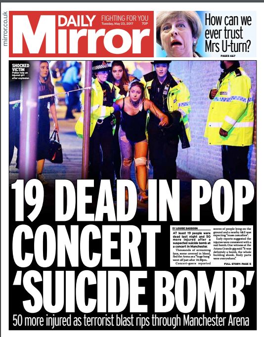
Lastly, let's look at how the 'Daily Mirror' has portrayed this story as they are one of the most open, reformer, left-wing popular newspapers in England. Unlike the 'Daily Express' and 'The Guardian', the 'Daily Mirror' have not used Saffie as their primary case study and selling point, instead, the CVI shows a long shot of 2 female police officers aiding a wounded teenage girl. This still allows the wounded youth selling ideal to arise, but it allows a younger audience to connect more personally with this story, therefore allowing their target audience to broaden. Plus, as the CVI shows a coloured male police officer, we can sue this as evidence that the 'Daily Mirror' has been more multicultural in their presentation of the attack.

And as we read the story, there is no insulting of the race of the suicide bomber, nor any racist or discriminatory remarks at all. Much like 'The Guardian' their text such as their masthead "19 dead in pop concert 'suicide bomb' has ignored any degrading insults and name calling found in the 'Daily Express', thus fulfilling their tagline of "Fighting for you" as they have proven to create an equal look at the tragedy, and are more factual and less idealised.

Wednesday, 25 October 2017

Representation of Age in 'The One That Got Away' by Katy Perry

Representation of Age in 'The One That Got Away' by Katy Perry - Rhys Wallett


In the music video for 'The One That Got Away' by Katy Perry, there is a rife representation of age, be it of youth or the elderly, which can form either positive or negative view of how these communities can be represented.

If we are to start with the Elderly and how they, as a community are represented, we can use the first opening scene which the mise en scene shows a long shot/ panning shot of a modern looking house, with rectangular and line design. In addition, the beauty and upkeep of the house, along with the view of the garden trail and patio, suggest wealth and comfort. This means that the elderly couple who live in the house have obvious money and superiority regarding real estate, due to their hard work and money they received in their youth. This, while linking to the stereotype that the Elderly are rich and comfortable, does not portray the Elderly in a negative way; it simply means that they are further along in life than those who are younger, which is true.

However, in the next scene where we see a long shot of the Elderly couple which the mise en scene shows them wearing monotone colours of black, white and grey. This colour rule of three can have connotations of bleakness and boredom, therefore it allows a negative representation of the elderly to be conveyed as it creates the regressive ideology that the Elderly are boring and lifeless. Plus, there is an obvious tension between the elderly couple as Perry provides a bleak answer of "It was fine" to his question while still using indirect mode of address, almost as if he doesn't deserve her attention. This, alongside with when the man sighs and rolls his eyes complainingly, suggests that their relationship has worsened with age, which can be a play on the belief that relationships don't last as we age, showing how the Elderly turn bitter as a community, which is a regressive representation as the Elderly are not portrayed as joyous as people once in the video, be it due to the dead ex-lover or a consequence of ageing.

Furthermore, when we are to look at the scene where we see a long shot of the considerably aged star vehicle who shows to be caressing the spot next to her which is to be a motion for where her deceased lover should be, we get a feel of sadness and misery emanating from the scene. This can show how the Elderly community are generally disconsolate and dismal, which is a negative representation as it could be suggesting that you don't get to love life when you're old. Your time in the spotlight has long since faded, which we as a society know to be untrue.

Yet this can also be a hint towards co-dependence regarding the stereotype as a stereotype regarding the Elderly is that they will leech off their younger family until they pass away, which could be shown here as older Perry is reliant on his memory and is not shown to be independent at all.

Now to look at how the youth are represented. The first time we see young Perry, it is in a long zoom shot of her with her (who we assume) boyfriend, which the mise en scene shows her wearing a man's shirt and her sketching, in a minuscule flat. The connotations here are prevalent in an abundance, with the decision to be in a small flat is a connotation of being cheap and scarce of money; they can afford only this titchy flat. This links to the 'independent teenager' stereotype, which is that a young person/couple will rent out a way too small apartment as it is all they can afford and they struggle to make ends meet during the time they are in their studies or have left them to enter the real world. This doesn't necessarily portray young adults in a negative light, however, it just explains that it is unlikely someone so young, especially sketchers who make minimal money, would have access to glorious and lush living which the Elderly couple do: Your accommodation will improve with age, which is fact nowadays.

Moreover, when we are to consider the appearance of Perry, we can form a judgement of wealth, such as how at her flat she wears her supposed boyfriend's shirt and from what we can tell nothing waist down. This has connotations of laziness and content; she is so used to living with her Boyfriend that she doesn't care to dress up for him anymore. However, as this can also have connotations of love, it allows the positive ideology that the young can be loving and sweet, which allows a more heartfelt representation to be had. Yet when she leaves the house to attend what seems to be a wedding, the mise en scene shows her wearing a salmon pink dress with a veil, which can have connotations of wealth and class as she is looking made up and as a result, beautiful. Thus, showing how the youth can have style and fashion, which shows that they can wear nice clothes, subverting the stereotype that the youth have a poor sense of fashion, making this positive. 

Monday, 16 October 2017

Task 3 - 16/10/17

Task 3 - Rhys Wallett


a)


"Should've gone to Specsavers" - Specsavers
"Passion for life" - Renault 
"Always giving you extra" - Halifax
"Have I got PPI?" - PPI.co.uk
"Here when you need us." - Screwfix

b)


This driving safely advert has used shock tactics effectively as in it, when studying the mise en scene of the piece, we see a close up of the driver with her phone, then immediately get a medium close-up  tracking shot of the car crashing and tumbling down the road, with your only forewarning as an audience being a mid shot of a stop sign before we see a truck smash the car, with key iconography being used for the stop sign to alert an audience that the purpose of it is essential for your safety. 

This is effective as it does alert an audience of the atrocity of a car crash and shows how menial distractions such as texting can have a life -costing consequences. Therefore it does fit into the 3 purposes of an ad, which is to inform, persuade and sell. It proves to inform with the end shot which shows white text that reads "IF YOUR'E  TEXTING, YOUR'E NOT DRIVING.", telling us as an audience that they wish to inform us about the dangers of texting and driving. For persuasion, they have used dramatic shock tactics like the sudden collision, the girls flying about and panning shots of the car hurling across the road, gripping the audience's attention as that tangles with our innate response as humans to aid fellow humans, especially youth in danger. Finally, as it trying to sell an ideal and form of discipline, this can be shown by the tomfoolery of the girls, and how karma results in the girls being punished, thus showing harrowing consequences sells the ideal to behave appropriately on the road.

c)


When applying Maslow's hierarchy of needs to this advert, there is evidence that this is appealing to two categories: Esteem needs and Self-actualization needs. The advert fits into the Esteem needs category with examples as to how in the second shot, the mise en scene shows the models walking away from the cameras laughing, with a low angle shot being used. The connotations of both the broad smiling and the low angle connote joy, confidence and just generally a success. Thus they have been represented as being aspirational to a mass audience, especially a mainstream audience, meaning that they will purchase products from Boohoo to be like said girls.

And it fits into the self-actualisation needs category as it links to a key part of the category: Achieving one's full potential. This can be shown with how long shots of the models at the pool, for example, looking beautiful and confident, can show how they have reached their full potential as women: to be beautiful and desirable, which is a very regressive represnstaion. Plus the end shot shows a long shot of the girls with it turning into a tilt shot as we get a view of an urban city at the end, which has connotations of wealth and success. Therefore, this plays with an audience's view of success, prompting them to purchase Boohoo's products.

d)


In this instalment called "Pals" for Nationwide's "Voices Nationwide" campaign, there are many stereotypes, especially regarding gender shown here. For starters, the stereotype that men must be controlling and dominant over women has been subverted as in it, they show to be fairly equal and how he says "She has stolen 6 of my T-shirts this year, and she thinks I don't know" which shows acceptance and lack of aggression towards Laurie, which is a definite advancement towards feminism as back in the 1940's for example, if a woman ever attempted to do that with her husband's clothes, she could expect to be abused, harassed and shamed. If you look at the trailer for the 1951 adaptation of A Streetcar Named Desire, we can see that Stanley Kowalski is very abusive towards Stella and the protagonist Blanche Dubois.


When comparing the Nationwide ad to the trailer for A Streetcar Named Desire, we can see a definite advancement in equal treatment and a decrease in aggression and a 'primal' outlook if you will. In addition, there is also the stereotype that women are weak and require male support, which is still enforced in the Nationwide advertisement when Laurie says "He always checks I get home safe." which could be argued both ways as while it is regressive as she is almost dependant on his care to ensure her safety, it can also be argued to be a kind gesture, which society would deem as noble as he is showing care and consideration, and would be considered by society a noble and moral action. Is it promoting sexism or good ethics?

e)


f) 

In Media advertisements or film, music can be used in genres like horror to add fear to their trailer, creating a theme of shock and worry. For example, in the trailer for Annabelle, towards the end, we hear a non-diegetic sound and a jack in the box being winded up, but alongside with the horrors on screen, makes the childish sound worrisome and scary, contributing to the paralytic fear the movie hopes to achieve.


In addition, music can also be used to add a groove to the piece, such as how the song "Papapapa" has been used in the Boohoo ad makes us as an audience feel confident and empowered, which will help prompt an audience to purchase Boohoo products.

Furthermore, music can also be used to add a sombre theme, which would be common in charity ads. Typically this involves sad, a depressing piano which makes an audience feel upset and empathetic, prompting them to donate towards the cause.

Plus,  if a company creates their own trademark 'song'  then that can be used to promote their brand image, such as how a general mainstream audience would be familiar with the GoComapre man and song, which will trigger a memory lapse in an audience, which will persuade them to try it out.

g)


Wynne Evans - The GoCompare man


Friday, 13 October 2017

Representation of Ethnicity in 'Unbreakable Kimmy Schmidt' and 'Popchips'

Representation of Ethnicity in 'Unbreakable Kimmy Schmidt' and 'Popchips' - Rhys Wallett


In the trailer for Netflix's Unbreakable Kimmy Schmidt, there is a very peculiar representation of race portrayed for all races. Let's start with the representation of black people, with the primary representation of the race being embedded in Titus Andromedon, in which he is portrayed as excessively homosexual and 'fabulous' per se. This is shown in the duo shot of Kimmy and Titus which the mise en scene shows Titus going "Ooh"! with a sassy tone, wearing a rainbow headband (which is iconography for the LGBT community) and wearing a tank top which we can see the top right of a love heart in the mid shot. This is interesting as this definitely subverts numerous stereotypes regarding coloured people such as how they must be, stereotypically, boring, have an accent and engage in criminal activities and instead, Netflix has decided to make Titus a gay icon, with evidence such as how he says "It is, girl.",  breaks into dance sporadically dressed as a Roman and possess a generally effeminate posture when confronting Kimmy about why she is "scared of velcro.". Yet this can be open for debate as while it does provide a progressive representation of different ethnicities, can the same be said for sexuality? On a side note, you could argue that how they have shown Titus, a 'fabulous' homosexual, this is regressive for the LGBT community as it can create the ideology that if you're gay, you're extravagant, which we know is now true.

In addition, there is also a minor reference to the Spanish Culture and ethnicity, but it isn't necessarily progressive. We see this in the first which the mise en scene shows a long shot of 4 females, 3 Caucasian and one of Spanish ethnicity surrounding a Christmas tree in a bunker. The shot shows Donna wearing a purple unflattering dress, with next to all of her flesh being concealed and singing along. A critic may argue that this lack of skin shown, which prevents Laura Mulvey's theory from being prevalent, could be because that Netflix is attempting to prove an idea that no one wants to see a person of Spanish heritage as 'sexy'. They must be dressed fully and unflatteringly and as she has no individual voice, could suggest how she must conform, obey and remain silent in society, which could be considered hugely regressive. In addition, when looking at the mise en scene of the women, the 3 Caucasian women (Kimmy, Cyndee and Gretchen), they have more of a 'Hollywood' body, with skinny waists, long hair and white skin. This could suggest how Unbreakable Kimmy Schmidt may be showing that only those with white skin can be 'sexy' per se as they have body types ideal for modern beauty, meanwhile, Donna has a bit more cellulite and has a more of a plump figure, which society would find less attractive.

In contrast, while there is an advantage to being Caucasian shown in the show, their representation as a race is far from perfect, with Kimmy and Jacqueline being key factors to this. If we start with the eponymous character  Kimmy Schmidt, we get themes of uniqueness, stupidity and joy. The theme of 'stupidity' can be shown in the very first scene when she is singing "Apocolypse, Apolcolypse, we did it with our dumbness." in the bunker, due to her being a member of a cult for 15 years which is laughable as she has been forced to believe the world died of an apocalypse because humans are dumb. This makes for humour when she is rescued, although when she is free, she still acts foolish such as how when the mise en scene shows a long shot of Titus showing Kimmy her living arrangements, a crappy wardrobe with failing walls, to which she says "I will be VERY comfortable here" which shows that her childish attitude allows her to be excited over what a general adult audience would find unsatisfactory and appalling as living arrangements. Plus when she proceeds to attack a man who is offering her her bag in the long shot, she proves to be funny as she is unaware that this social construct is considered polite and noble, therefore her incorrect response shows her confusion while adapting to modern society.

Plus, the character Jacqueline brings mostly negative representations for those of white ethnicity, as she proves to be excessively rich, ignorant and bossy with an example of when Jacqueline is interviewing Kimmy and says "Then get me up at 10, but don't wake me up." This confusing juxtaposition of a sentence can add humour as we know that said task is impossible as an audience, so we get a vaguely idiotic but highly snobbish theme from Jacqueline. Plus when she shows to offer water, to which Kimmy declines, she throws it in the bin, showing total ignorance to saving money, the environment and general intelligence which shows how she is stuck up. This could suggest that white people are stereotypically all rich, snobbish and ignorant, which is regressive as it creates an ideology that if you are white, you must be excessively rich and cruel.


And when we are analysing this Popchips advert, we can definitely emanate ethnic and racial representations which can be regarded as racist. For starters, they prove to almost glorify Indian ethnicity and use common stereotypes to appeal to the audience. A first example would be how the miss en scene shows a medium close-up shot with the man smiling broadly and raising his hands giving a thumbs up. This gesture is stereotypically loin med to those of Indian heritage and the Indian culture, as it can link to the stereotype of 'The Indian Cab Driver' which involved them smiling broadly and giving a somewhat foolish thumbs up when engaged in conversation and receiving tips. This hugely limiting and regressive stereotype which has been portrayed in the print ad portrays the Indian culture in a negative way, and tells a mainstream, audience, the majority most likely a Caucasian audience, that those of Indian ethnicity all act in this manner, which a post-modern reformer audience would consider tomfoolery.

Plus, we can use the title in the ad as evidence of potential discrimination of the Indian culture, as the noun "bombay" has been used in replacement of the noun "bomb", which is a commonly used phrase. Instead in some blatantly terrible way, they have made the phrase stereotypically "Indian" if you will. Plus, an Indian audience would most likely take offence to this as Bombay (now Mumbai) is a key and essential part to Indian culture, only to become now a form of marketing scheme.

Furthermore, the clothes he is wearing can be disrespectful as he is wearing clothes that would be traditionally worn in Bollywood culture, a beautiful dance essential to India's history. To now be the clothes of a 'cab driver' stereotype who is smiling to promote Popchips, can be considered highly degrading and offensive as they are mocking, twisting and glorifying India's rich history to promote their brand of chips. Overall, this ad is hugely regressive and there seems to be no progressive ideologies shown in this ad at all.

Monday, 9 October 2017

A look into Barnados: The Row

A look into Barnados: The Row - Rhys Wallett


I felt that this ad was a success regarding its primary purpose: to inform audiences of the psychological trauma domestic abuse can cause to youth. this is shown by a close up of the child who uses both direct and indirect mode of addresses to show signs of distress, which is effective as it feeds off the innate response in all of us to care for a child when we see said child in danger or distress, therefore every audience member will be emotionally moved by this, meanwhile the phrase "Give £2 a month..." is said twice throughout the advertisement which keeps the audience clearly on the primary objective: to sell their charity to help assist in the welfare of children. 

Sunday, 8 October 2017

Advertising Campaign

Advertising Campaign - Rhys Wallett


An advertising campaign would be argued by many corporations, an effective way of portraying an ideal, dream or product. While the majority of advertising campaigns are used to portray a message, such as Dove's 2006 Real Beauty campaign, some companies such as Marmite have used an advertising campaign to respond to social criticism and ideas towards the company, while still cleverly selling their product. Below I will explain how this is achieved.

Firstly, let's start with some essential context. Marmite is a very unique brand as their product is one that stereotypically people either 'love' or 'hate'; there's no grey area. As a result, it is often that people will argue about the taste of Marmite, and could lead to either an increase in sales as people will be keen to try out the hype or hinder their sales as people will get deterred by the negative criticism of the product. Which is why Marmite's 2017 "Lover or Hater" campaign was in my opinion, very clever thinking on Marmite's part and it calls out these stereotypes and uses them to sell their product.

Let's start with the TV advertisement called "Test Results". in the ad, we see 5 different family situations which the mise en scene shows each holding a yellow and black envelope giving results on whether they are marmite lovers or haters. However, they prove to blow this way out of proportion in all scenarios, in both comic and serious ways. An example of the comic ideal is in the elderly couple scenario at the dining table, in which the wife becomes furious when the husband says "I prefer jam" as if his hater result is no worse than murder. On a side note, Marmite has used very intriguing iconography in this advertisement as their "results" are portrayed as candour and trustworthy, not one family distrusts them, which could suggest how Marmite is pushing how they are honest as a company and are attempting to prove the genuinity of their product subconsciously. Yet as we continue with he elderly scenario, phrases such as  "Have you ever done it...here?" and "In this house?" with "on this table?!" give a definite sense that a normal audience would talk this away about adultery as this expression of speech and choice of words would be used by a wife if the husband was confessing about being unfaithful. This shows that Marmite is attempting to use the cliche and alarming situation of the truth being revealed of a mistress and attempting to transfer the intensity of the scene to their product, their product has a terrific impact on the relationship, and how the husband has been 'unfaithful' to Marmite per se, the wife now has similar anger as jam was another woman.

And that is just one example. We also have a father and son scenario, where the son confesses he's a marmite lover and the dad hugs him and says "We just want you to be happy." This with the way these expressions are said is an obvious link to the coming out cliche, the son is coming out to his dad per se but instead of being the expected about him being a homosexual, he is a fan of marmite. This is a more serious cliche for Marmite to use as it is definitely increasing in occurrences more recently as more teenagers feel more comfortable to confide in their parents as homophobia decreases, yet it is still effective as not only will it apply to a reformer audience who would be happy this is highlighting how this reaction is essential in the real thing, it adds an aura of comedy around it, while proving they support the LGBTQAI+ community, which will generally improve the brand image of Marmite.

And if we are to know look at the still image advert, which could be found on print texts anywhere, we also get a "Lover or Hater" theme, which is obvious from the masthead which says "WHO ARE YOU?" in bold sans serif font. In addition, a similar graphic feature has been used for both texts that say "I'm a LOVER" or "I'm a HATER" which the mise en scene shows are two love hearts, one with angel wings and one with flames. This is interesting as Marmite is using Christian belief and ideology to push their product, the "Lovers" are represented with a halo and wings, similar to that of an angel in the Bible, meanwhile, the "Haters" are represented with flames and abyss, likewise to the fire and chaos of Hell. This shows that marmite prefers those who love their product and as they obviously would to the haters, however, the ad is saying to go purchase their product and taste it to see which category they belong too, and as the haters are portrayed so negatively but subtly, Marmite are using human pride and arrogance to push their product, customers will be curious to see which one they are, and could be potentially offended with being a potential hater, which means a higher profit for Marmite.


Tuesday, 3 October 2017

A General Look at Gender Stereotypes

A General Look at Gender Stereotypes - Rhys Wallett


Throughout the years, the two genders (and all in between) have had numerous representations in the media, with some positive representations and some negative, and have morphed considerably throughout the ages. As a result, as representations and roles in society of the genders have changed, so have the stereotypes of the genders generally. However, while some stereotypes can be pleasing or non-harmful, there are lots of stereotypes that can be harmful to the views of the genders.

Let's start with the men. As humans have evolved, nature tended to favour men in the primitive times as they would provide for the women and child while the mother would care for the said child and be submissive to the man. Granted, its nothing like this nowadays but as a result, stereotypes linking to this have risen. The first is how all men are supposed to be strong. This originated in medieval times as if men were strong and valiant, they would receive eternal glory and would be heroines. As such, society began to believe that if you weren't strong like Hercules for example, you not in the real sense a 'man' and would be discarded and rejected by women for either wife's or otherwise. This is a total barbaric stereotype as not all men are strong, and this expectation to be 'masculine' has caused much emotional abuse and self-pity for men and as this can link to excessive straining exercise, or can even link to anorexia nervosa, which can cause both physical and emotional damage.

A second stereotype is that men must be in charge of the household. Now typically you would argue this is way worse for the women as they're submissive and were often abused by their husband's (See A Streetcar Named Desire starring Marlon Brando for evidence), but could this be unpleasant for the men?


As men are supposed to be the dominant figure, they are expected to be somewhat cruel and demanding and is plausible that said man would not wish to have this attitude as they would wish to be caring and love their wives. Moreover, they may not even desire a wife due to asexuality, homosexuality or any other logical explanation, thus this can also hurt men emotionally as this expectation to aspire to can cause self-hatred from the said male.

Now to look at the women. Unfortunately, women have a whole case study of regressive stereotypes that still continue to hold back women. One example is that women are expected to a) have children and b) care solely for them. this is again a very unpleasant stereotype as back in the old days, women's primary purpose for existence was to have kids and raise them (with a strong prejudice against female youth.) This provides little joy for women as this stereotype enforces how the men don't help, which means all the burden lies on their shoulder, which leaves little room for a career, social bonding and just generally a life. Plus as infertility amongst women has always been existent, this can result in emotional abuse being faced by the women either by themselves as they are upset they cannot bear children or from others, and in extreme cases can lead to physical abuse, with women being killed in ancient times if they could not give birth. Furthermore, even men can be affected badly by this as if the men wished to raise the child co-dependently and equally with the mother, or even raise the kids as a single dad, prejudice and criticism would be faced by the man.

A second stereotype is that women must always be beautiful. Now as the standards of beauty and ideal look for women have definitely changed over time, the expectation that women should always look their best has most certainly not. Now more than ever, women face criticism from the media and friends and family's to be 'beautiful' which can be very harmful as this can cause low self-esteem amongst women and can lead to many dangerous outcomes like anorexia nervosa, mutilation of bodies and putting dangerous chemicals on your body. This has been known to be a barbaric stereotype, especially due to Photoshop and to Hollywood's standards, actual 'beauty' is next to impossible.

In addition to this, there are many other stereotypes present to both genders which can influence people. For example, if we were to consider males you have the 'nerd' stereotype which typically involves a man who is not muscly and gifted, stereotypically wears glasses and is generally unsuccessful with women. And there is a definite emphasis on this stereotype today, with examples such as The Inbetweeners Movie starring James Buckley.


In this trailer, we can see clear evidence that these stereotypes are shown in the movie, and have been used for comedic purposes. For starters, alongside the nerd stereotype, we also have the idiot stereotype, which is their stupidity and lack of common knowledge is so laughable, their chances with women are as appalling as the nerds. This is shown with Neil in the coach scene where the mise en scene shows a mid shot of Jay and Neil telling Will about how they don't plan to see the Greek structures, to which Neil says "You can see that s*it anywhere" which is clearly a foolish remark as common knowledge tells us greek structures are in Greece only, therefore we can laugh at Neil's stupidity, while feeling sympathetic for him, which is what the director was attempting to do.

In addition, if we are to look at how women are represented in The Inbetweeners Movie trailer, the stereotypes used still provide a negative light as the stereotype that women should be more no than sex objects is clearly used often. An example is how Jay says "two weeks of sun, sea, booze, minge, f*nny and sex." which is how Jay has described women. These rather offensive and degrading nouns which are colloquialisms for women show how the men, Jay, in particular, view women in an almost primal sense, objects of reproductive and sexual utility, and not much else, also portraying women in a negative way. In addition, the stereotype that women should conform to men's standards of beauty is also shown in the movie, when the guys have successfully engaged with the ladies and Jay says "I better not get the fat one." while addressing Jane, which shows how degraded women are portrayed in this movie. If a woman does not possess a body which fits Hollywood's beauty standards, they deserve to be criticised, scolded and degraded by men, is the ideal shown in this movie. Plus, it also shows how selfish, primal and Machiavellian men are, however, it is comedic as the trailer later shows a long shot where Jay is bored while in conversation with Jane, showing punishment on Jay's sake for being so offensive towards women. Therefore as there is the use of Schadenfreude in the trailer, the movie is allowed to use these regressive stereotypes as punishment has been given to these men, making it funny, rather than downright sexist.